PRODUCT RESEARCH AND STRATEGY
CLAIMS SUBMISSION WEBSITE
or how I discovered the value of secondary research when talking to users is not possible
Client
Major Insurance Provider
Duration
6 weeks
Interface
Responsive Web
ABOUT THE PROJECT
A major insurance provider asked me to look into allowing customers to submit insurance claims from a mobile device. I needed to understand the drivers of customer claims satisfaction and bake that into the conceptual designs and roadmap. Typically, I get to speak with end users as part of discovery. However, tight deadlines and skepticism about the value of user research meant I had to find other sources of user feedback.
OTHER CONSTRAINTS AND CONSIDERATIONS
SKEPTICISM
Past experiences with designers left my client worried we may not deliver as promised
NO ACCESS TO USERS
Due to time constraints, sponsors did not want us talking to users to validate our concepts
MY ROLE
As the UX strategist, I was responsible for running stakeholder workshops, preparing conceptual designs, and presenting my recommendations to the leadership team.
KEY ACTIVITIES
- RESEARCH 25%
- DATA SYNTHESIS 65%
- STAKEHOLDER PRESENTATIONS 10%
MY APPROACH
Because I was not granted permission to speak to actual users, I had to use several indirect sources. I relied on secondary research to define success for the project in terms of happy customers. I also performed a heuristic analysis of the existing to identify gaps in the current offering (in light of user needs and business goals).
BY THE NUMBERS
Articles Read
Heuristic Evaluation
Service Design Assessments
USER RESEARCH
SECONDARY RESEARCH
I found and reviewed dozens on articles to understand the drivers of customer satisfaction when submitting an insurance claim. These drivers became the basis for features ideas on the new website.
PRODUCT STRATEGY
HEURISTIC EVALUATION
I reviewed the existing web experience to get a baseline for how it works today. I combined Jakob Nielsen’s 10 Heuristics for User Interface Design with some criteria specific to the insurance industry to document areas for improvement.
PRODUCT STRATEGY
CURRENT STATE ANALYSIS
I evaluated the entire process (i.e., people, procedures, and technology) by which a customer files a claim against the experience goals I had identified and validated with stakeholders. This holistic vantage helped me to identify the problems-to-solves with the new app, as well as ones a new app was not meant fix.
DESIGN RECOMMENDATIONS
DESIGN RECOMMENDATIONS
MOBILE READY?
A literal mobile translation of the current claims submission website into a responsive site was risky. The process was overly long and prone to error, particularly where mobile users and open text fields were concerned. In addition, the number of questions would need to be reduced and the way users entered information would need to be reconceived for the mobile user.
DESIGN RECOMMENDATIONS
A GUT REHAB
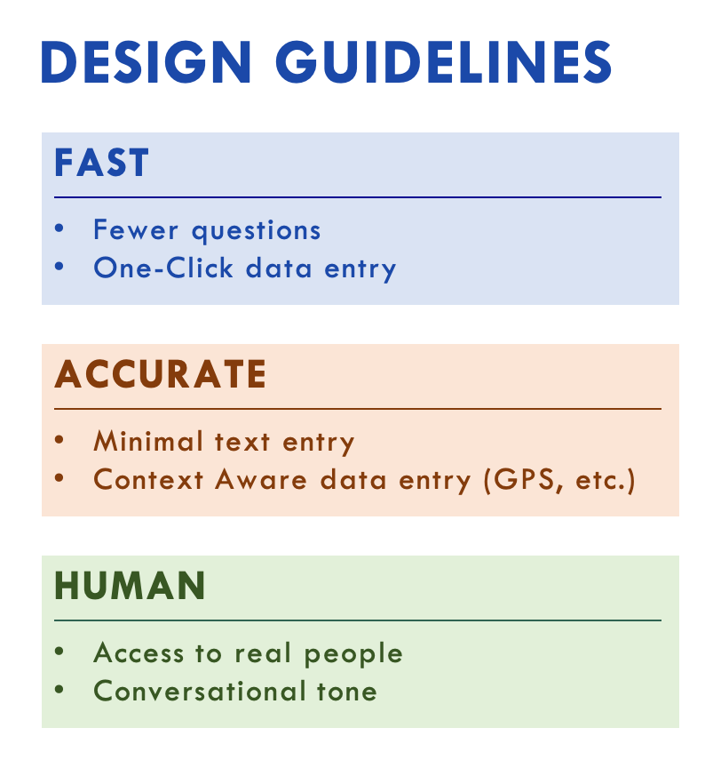
I created a set of design guidelines that placed human need above back office efficiency. At the highest level, the site needed to FAST, ACCURATE and HUMAN when interacting with users during a stressful time for them.
.
DESIGN RECOMMENDATIONS
CONTEMPLATED DESIGN
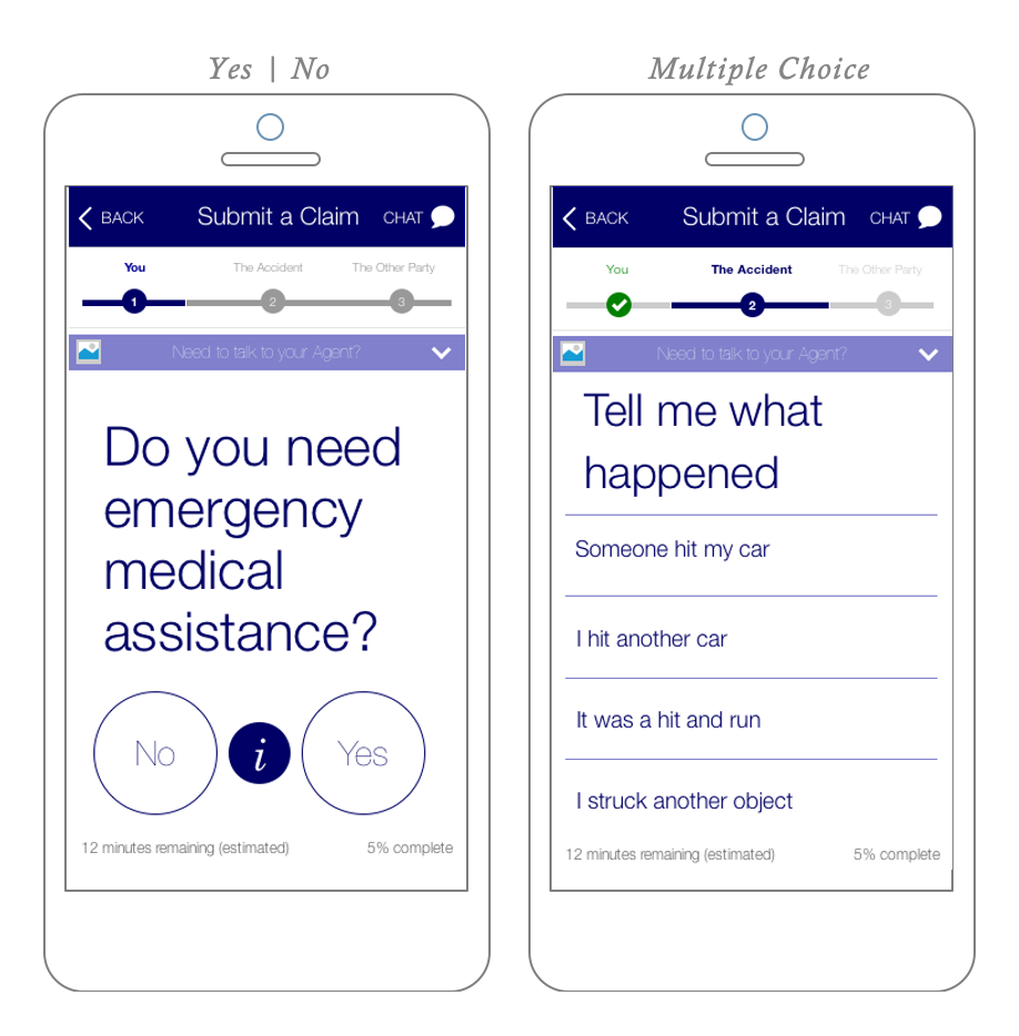
I identified a handful of reusable design patterns that could be used throughout the site’s 200 question submission process. For mobile users, I recommended rewording questions into yes/no or multiple-choice options to eliminate the need for manual text entry.

